


Description
Kraft Underwear Packaging Boxes For Retail Brands
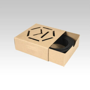
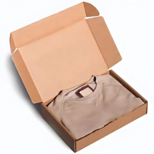
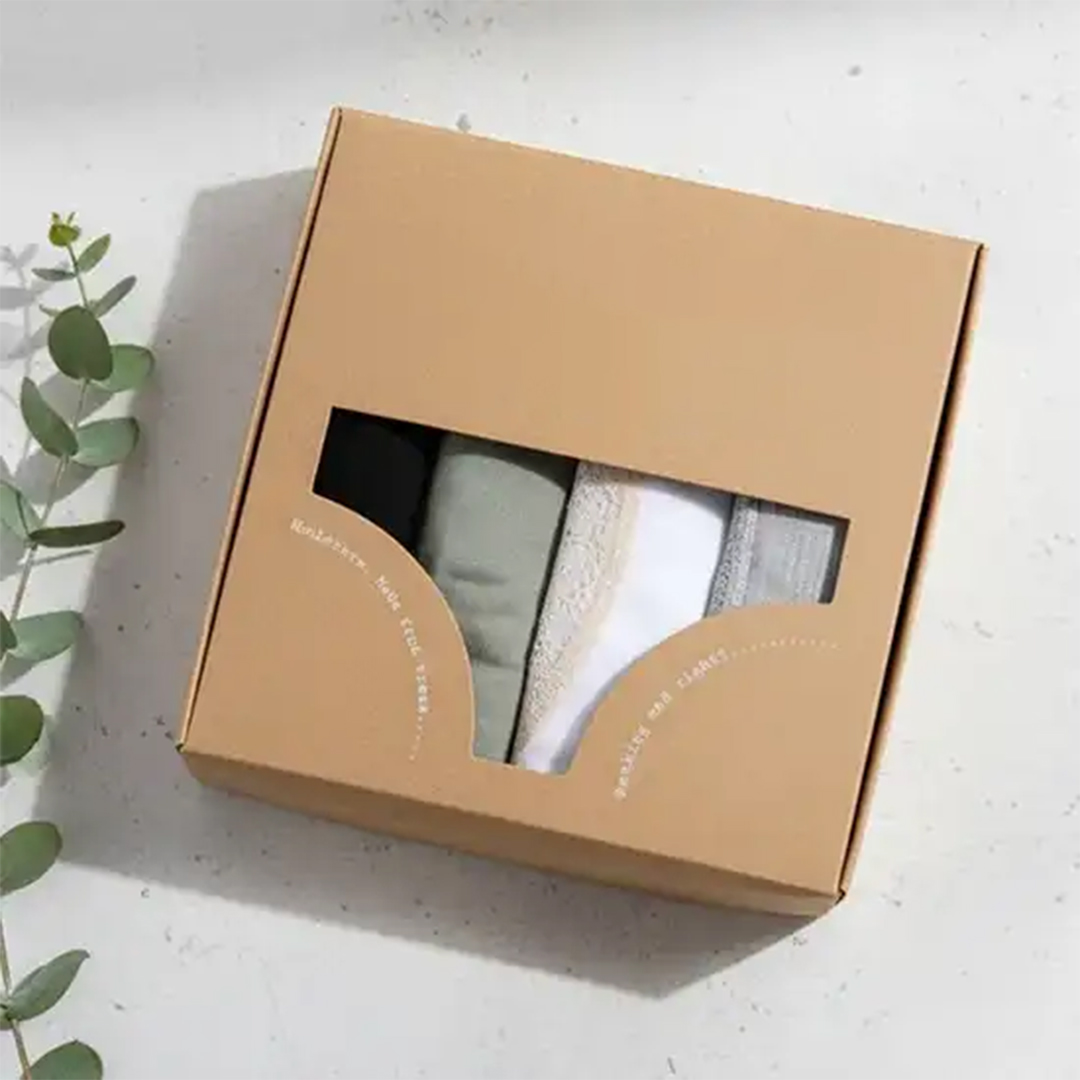
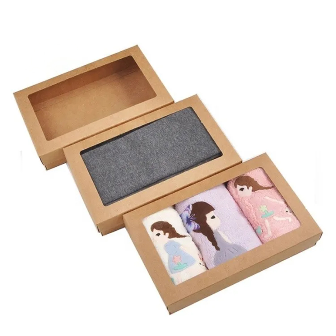
Kraft underwear packaging boxes are used when brands want a neat fold, a clean shelf face, and a pack that stays square from stockroom to customer hands. In the second sentence, Men and women’s lines often pair these boxes with Kraft Sock Packaging Boxes so the full apparel range follows the same kraft tone and sizing logic without mismatched presentation. The rigid look helps underwear packs feel more organized, especially when you sell multiple colors, sizes, or styles under one label. Many stores prefer a box that stacks evenly, keeps edges crisp, and protects folded fabric from dust and handling marks.
A good box structure also supports faster packing because the fold sits in place and the lid area stays aligned. When you ship or restock often, the main goal is consistency, not extra decoration. That is why custom kraft underwear packaging boxes are planned around predictable sizing, clean corners, and stable panels that do not bow in storage racks. If you are comparing kraft underwear boxes across materials, focus on how they hold shape under stacking and how well they protect the fold line, because that is what customers notice when the box is opened.
What Makes Underwear Packs Feel Organized Inside
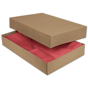
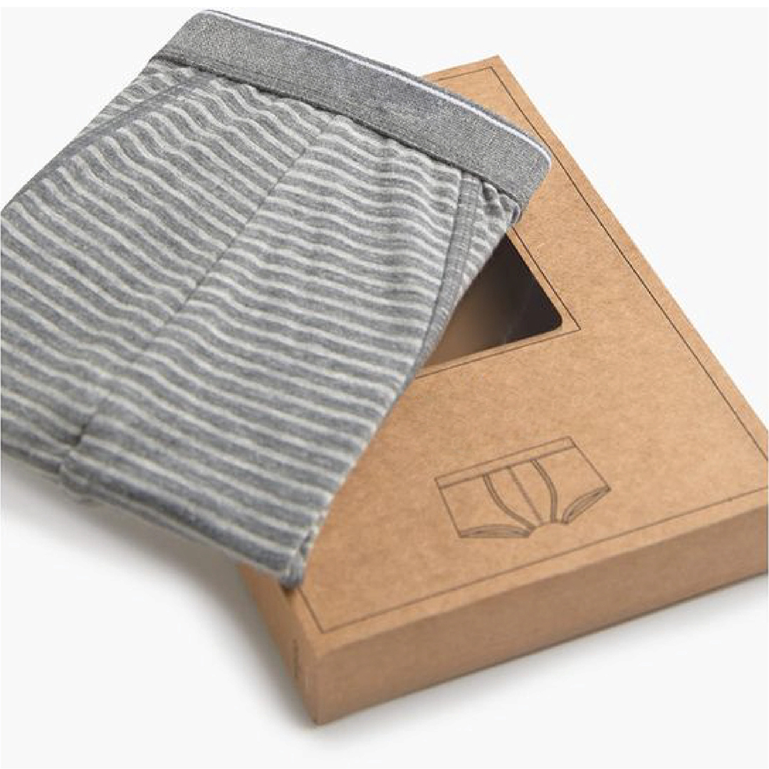
Underwear packaging feels organized when the inside space controls movement and the fold sits flat without pressure. A close-fit layout keeps fabric from shifting, which helps the first view look tidy and reduces wrinkles caused by repeated handling. Brands often add a simple inner card, a band wrap, or a divider sheet so the product stays centered and the inside does not look empty.
If the pack includes multiple items, the structure should guide placement so items do not rub. That matters for elastic edges and delicate trims because rubbing can create small snags during transit. When the box depth matches the folded height, the lid closes naturally and the pack stays consistent across different sizes. This improves reorders because the same dieline works for repeated runs with only minor artwork updates.
Quick Points Buyers Compare For Store Packs
- Clean front face that looks uniform in shelf rows
- Fold protection that limits shifting and edge rubbing
- Stable corners that stay crisp in handling
- Size planning that supports repeat runs with less variation
Steps To Plan A Reliable Underwear Box Size
- Measure the folded product with any band wrap included
- Add controlled clearance so the fold stays flat but not tight
- Choose depth that supports inserts without lid pressure
- Confirm stacking behavior in storage cartons
- Approve dieline settings for repeat ordering
| Feature Focus | Details | Material Options | Finishing Choices | Add-ons & Features | Usage/Application |
|---|---|---|---|---|---|
| Shelf Alignment | Keeps boxes neat in retail rows | Kraft wrap over rigid board | Matte, Gloss | Edge control folds | Retail underwear lines |
| Fold Protection | Reduces shifting and wrinkles | Rigid board build | Matte | Inner card option | Daily store handling |
| Corner Strength | Helps corners stay crisp | Thick board choices | Protective coat option | Reinforced base | Stockroom stacking |
| Size Control | Supports repeat runs | Fixed dieline | Matte, Gloss | Variant depth | Multi-size programs |
| Inner Neatness | Maintains tidy first view | Card inserts | Matte | Divider sheet | Bundled packs |
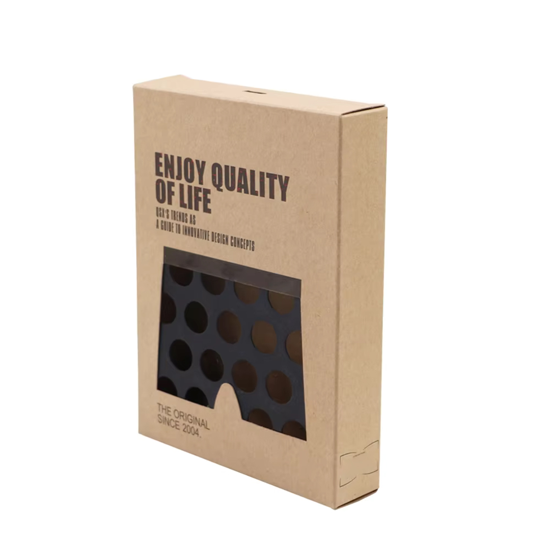
Custom Kraft Underwear Packaging Boxes For Lines
Custom kraft underwear packaging boxes help apparel brands keep a consistent look across products while still allowing size, depth, and inner layout changes. In the second sentence, many companies align underwear packaging with broader apparel packaging by using Kraft Apparel Boxes so the brand system stays cohesive across collections. This approach is useful when you sell multiple variants like trunks, briefs, boxer briefs, and lingerie items under the same identity. A unified packaging system also makes product photography and store displays look cleaner because colors and proportions remain consistent.
Branding Ideas That Look Clean On Kraft Surfaces
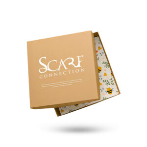
Kraft surfaces work well with simple, high-contrast branding where spacing is clear and text stays readable. Brands often keep the lid area clean and place key information on side panels so the front face remains balanced. When the typography is kept clear, the kraft tone supports a calm look without heavy ink coverage.
If you need more contrast, selective highlights can be used without covering the whole surface. The main goal is legibility and alignment, because uneven placement becomes obvious in shelf rows. For underwear packaging, clean branding also helps when customers keep the box for storage, because the packaging remains presentable after repeated handling.
Branding Details That Keep Packs Easy To Read
- Clear spacing around logos and product names
- Side panel layout that stays readable in stacks
- Consistent placement across sizes and variants
- Controlled ink coverage that suits kraft tone
Steps To Keep Artwork Consistent In Production
- Choose one primary lid layout and keep it stable
- Set safe margins away from folds and edges
- Keep text sizes readable under normal lighting
- Approve print placement for multiple box sizes
- Lock proof references for repeat orders
| Feature Focus | Details | Material Options | Finishing Choices | Add-ons & Features | Usage/Application |
|---|---|---|---|---|---|
| Lid Branding | Keeps front face balanced | Kraft wrap layers | Matte, Gloss | Spot UV highlight | Retail display |
| Side Panel Info | Supports stacked readability | Kraft + print layers | Matte | Size markers | Variant lines |
| Proof Matching | Maintains reorder look | Fixed references | Any finish | QC reference set | Seasonal runs |
| Inner Messaging | Adds tidy story inside | Inner liner | Matte | Printed inside | Premium lines |
| Contrast Control | Improves logo clarity | Underlayer option | Gloss | Foil accent option | Special editions |
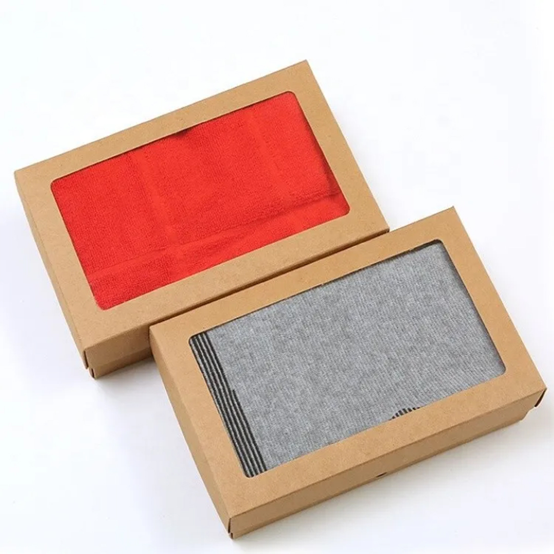
Kraft Lingerie Packaging Boxes With Premium Feel
Kraft lingerie packaging boxes are often chosen when the product needs a refined, organized look while staying simple and consistent across sizes. In the second sentence, brands that manage ongoing collections often keep production settings and dielines aligned through Kraft Box Pack so reorders match the same fit, finish, and overall presentation across campaign cycles. Lingerie packs usually need better fold protection because delicate trims can snag if items shift during shipping. A close-fit layout with an inner card can reduce movement and keep the first view tidy.
Finishes That Reduce Marks During Handling And Shipping
Matte finishes reduce glare and help the kraft tone stay even under different lighting, which supports product photography and store displays. Gloss finishes add more shine and can make printed areas appear stronger, while Spot UV can highlight a logo area with controlled contrast. The right finish depends on real handling conditions, because cartons, storage racks, and repeated touch can create rub marks at edges.
A protective surface also supports repeat programs because reorders arrive looking the same. If your boxes move through shipping steps, anti-scratch options can reduce visible wear on corners. The most useful planning approach is to choose finish settings once and keep them stable for future runs, so the packaging stays consistent across time.
Finish Choices Buyers Use For Apparel Packs
- Matte for low glare and steady kraft tone
- Gloss for stronger shine on printed areas
- Spot UV for controlled highlight on logos
- Protective coats for edge and corner wear control
Steps To Choose A Finish Based On Real Handling
- Define whether the box is store-only or shipped often
- Match finish to lighting needs for product photos
- Confirm rub exposure in cartons and storage racks
- Review proofs under normal and studio lighting
- Lock finish settings for repeat orders