


Description
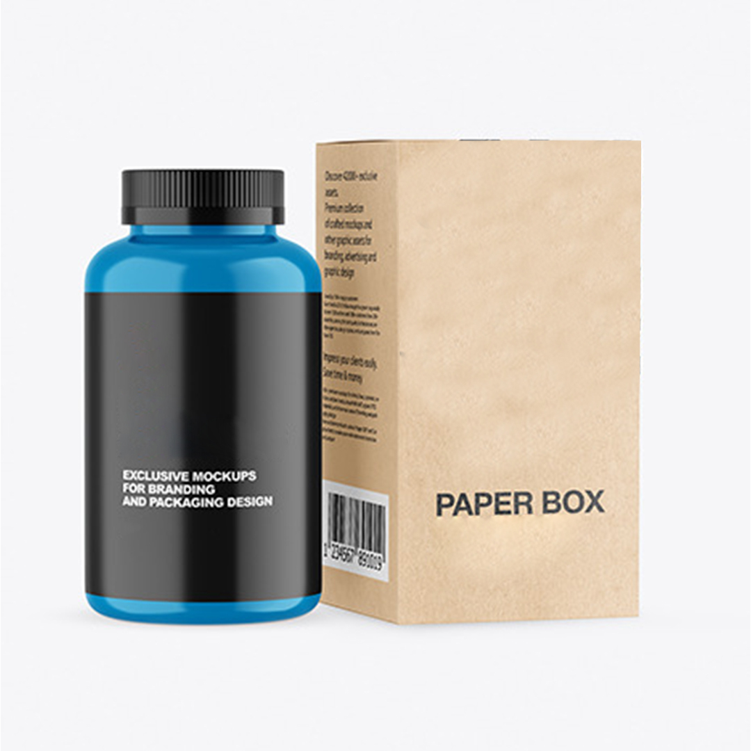
Kraft Supplement Boxes For Clean Daily Storage
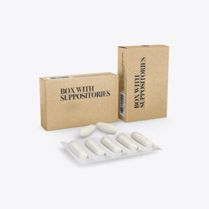
Kraft supplement boxes wholesale orders usually focus on clean stacking, strong panels, and clear label space for daily shelf handling. For vitamin lines, many brands align panel layouts using Kraft Vitamin Packaging Boxes as the matching reference for related SKUs in the same range. This approach keeps front panels consistent when counts, flavors, or strengths change. It also makes photos and shelf rows look more uniform. The carton stays easier to recognize during picking and packing.
Kraft supplement boxes also need practical fit so bottles and blisters do not move inside the pack. Kraft supplement packaging is often selected because the natural surface supports readable printing without looking busy. Kraft paper supplement boxes work well when you want a grounded shelf look with stable folds. When carton depth is planned correctly, the tuck stays neat and the box does not pop open in mailers. That keeps the product presentation cleaner when orders arrive.
How Supplement Cartons Stay Neat During Transit
Transit issues usually come from movement, weak folds, and carton rub inside shipping cases. A close fit reduces shaking, which helps protect labels and prevents corners from softening. Clean scoring matters because folds that crack can weaken the box and make edges look rough. A stable carton also stacks better, which reduces pressure points during storage.
Another common issue is surface wear, especially around edges where cartons touch each other. Coatings can help, but packing density and carton layout matter first. If a box is too loose inside a shipper, it will slide and rub more. When the structure is consistent across reorders, you get fewer surprises during large dispatch cycles.
Key Buying Signals For Supplement Carton Quality
- Panels stay square when cartons are stacked in rows
- Folds close cleanly without splitting at the edges
- Enough label space for directions and compliance copy
- Tuck fit stays tight during handling and shipping
- Outer surface handles light rub without looking patchy
Steps To Confirm Carton Fit And Panel Readability
- Measure bottles or blisters with seals and wrap included
- Check that the unit slides in without scraping labels
- Confirm side-panel space for ingredients and usage copy
- Test stacking in a shipper to see rub points on corners
- Review print contrast on kraft for small text clarity
| Feature Focus | Details | Material Options | Finishing Choices | Add-ons & Features | Usage/Application |
|---|---|---|---|---|---|
| Shelf Alignment | Keeps rows neat and front panels consistent | Kraft paperboard, kraft wrap layers | Matte, Gloss | Dust flaps | Daily retail shelves |
| Fit Control | Reduces internal movement for bottles | Kraft board thickness options | Matte | Inner tuck tuning | Capsule bottles |
| Transit Handling | Holds shape in mailers and shippers | Strong kraft board builds | Anti-scratch coating | Corner buffers | Online orders |
| Label Readability | Supports clear compliance panel layout | Kraft paper supplement boxes | Matte | Code stamp area | Regulated products |
| Reorder Consistency | Maintains dielines across repeat runs | Standard carton tooling | Any selected finish | QC match points | Ongoing supply |
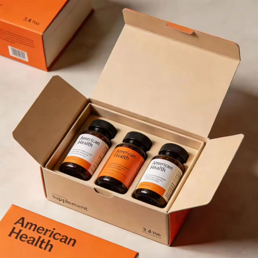
Custom Kraft Supplement Boxes For Brand Growth
Custom kraft supplement boxes help brands keep the same packaging style across a full range while changing only the product details. In regulated categories, many teams standardize layouts with Kraft Pharma boxes so compliance panels, warnings, and directions stay organized across multiple SKUs. That consistency supports faster packing and fewer labeling mistakes. It also helps customers compare products side by side without confusion. When the box system is stable, reorders become smoother.
Kraft supplement boxes wholesale plans also become easier when you keep one footprint and adjust depth for different counts. Kraft supplement packaging often uses consistent panel spacing so barcodes and ingredient blocks stay in predictable places. Kraft paper supplement boxes can support both minimal designs and heavier copy layouts, depending on your category needs. If you want brown kraft supplement packaging across the entire line, matching board feel and print settings helps the range look unified. That unity matters when customers buy multiple products in one order.
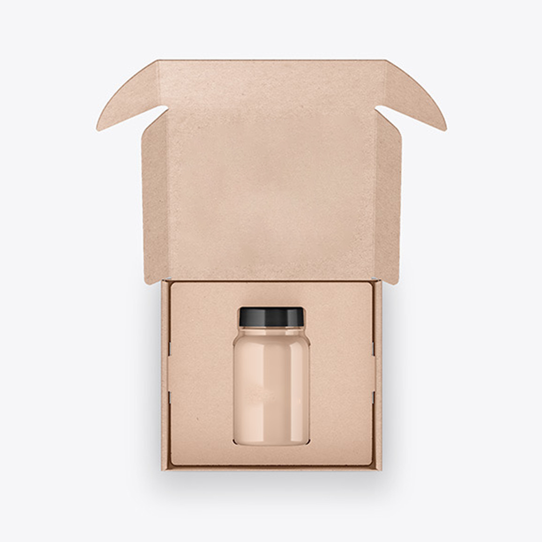
Sizing Rules For Bottles Blisters And Pouches
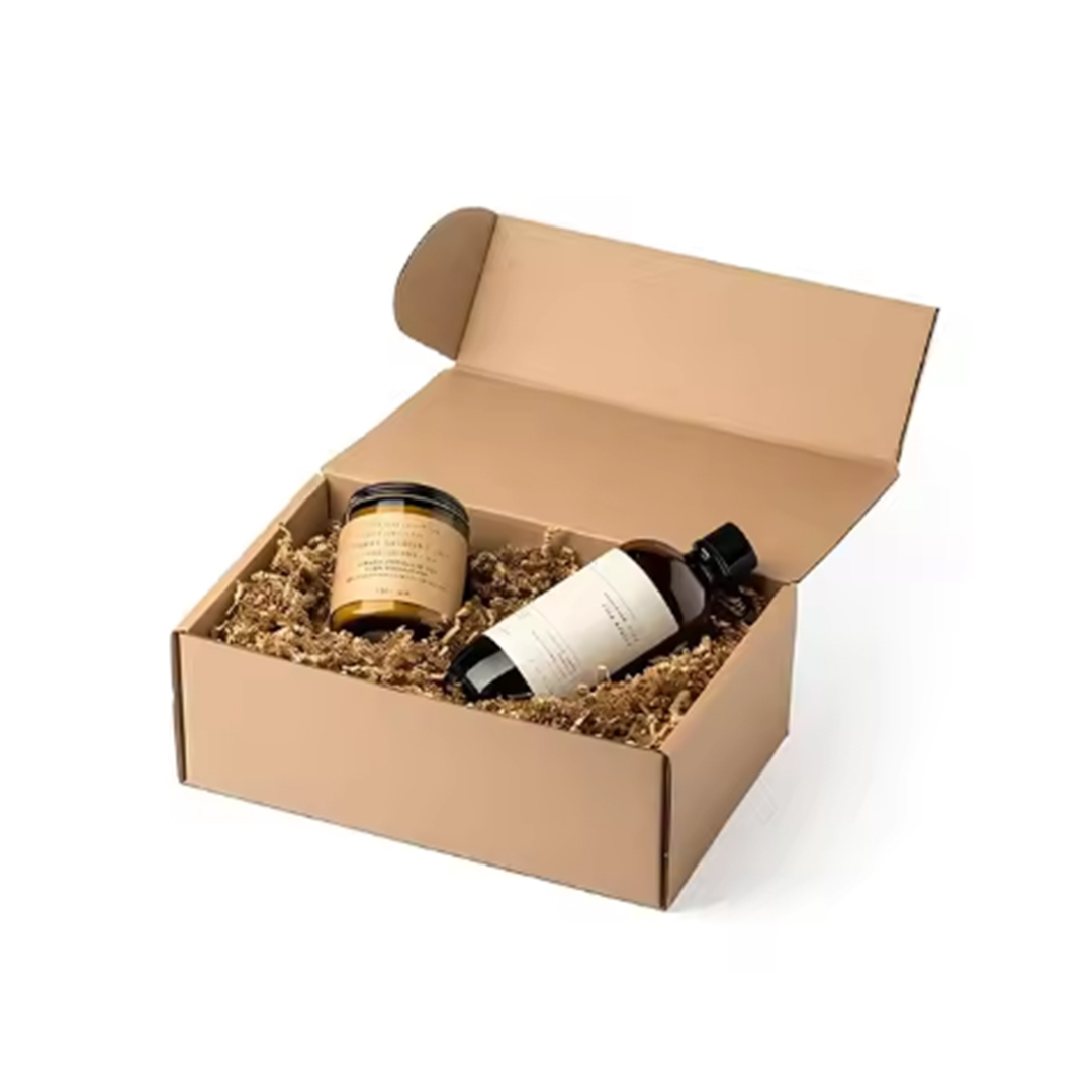
Sizing starts with the real unit, including cap height, tamper bands, shrink wrap, and any protective sleeve that stays on. Too much space increases movement, which can scuff labels and stress folds. Too little space slows packing and can mark labels during insertion. A controlled clearance helps cartons close neatly and stay aligned.
For blisters and sachets, internal width should prevent bending and curling during transit. Pouches also need depth planning so top seals do not bulge against the tuck area. When the size is set correctly, cartons stack better in storage and pack faster in bulk. That reduces handling issues during large dispatch cycles.
Practical Details That Improve Packing Consistency
- One footprint with depth changes keeps shelves organized
- Blister width prevents card bending during shipping
- Bottle fit reduces rattle and label scuffing
- Clear panel zones support readable compliance layout
- Stable folds reduce edge cracking during handling
Steps That Keep Bulk Supplement Orders Consistent
- Confirm unit dimensions with all seals and wraps included
- Choose closure style based on how you pack and seal
- Set internal clearance to reduce movement without squeezing
- Plan panel layout for barcode zones and warning copy
- Test a small run for packing speed and stacking stability
| Feature Focus | Details | Material Options | Finishing Choices | Add-ons & Features | Usage/Application |
|---|---|---|---|---|---|
| Bottle Stability | Helps reduce rattle and corner stress | Kraft board thickness choices | Matte, Gloss | Insert card option | Tablets and capsules |
| Blister Protection | Keeps cards flat and centered | Kraft paperboard builds | Matte | Divider support | Blister packs |
| Pouch Control | Prevents curl and bulge at closure | Kraft carton structures | Matte | Inner guide folds | Sachets and pouches |
| Compliance Layout | Keeps copy blocks readable and consistent | Kraft paper supplement boxes | Matte | Code stamp zone | Health categories |
| Range Uniformity | Maintains a unified shelf look | Brown kraft supplement packaging | Any selected finish | QC checkpoints | Multi-SKU lines |
Brown Kraft Supplement Packaging For Shelf Trust
Brown kraft supplement packaging is often chosen when brands want a grounded shelf look with steady carton strength for daily handling. For repeat campaigns and steady reorders, teams often rely on Kraft Box Pack to keep sizes, finishes, and print alignment consistent across the full supplement line. This consistency helps the range look unified even when different formulas share the same shelf space. It also supports cleaner product photos because panel alignment stays predictable. The carton feels more dependable in hand.
Kraft supplement boxes also benefit from finish choices that match how the cartons will be handled and shipped. Matte can reduce glare and keep text readable under store lighting. Gloss can lift contrast on design elements when you want a brighter look. Spot UV can highlight a logo area without changing the whole surface feel. Options like Matte, Gloss, and Spot UV can be paired with custom sizes and styles, design and shipping, fast turnaround timing, and high-quality material and printing options, while keeping the packaging description focused on practical outcomes.
Printing And Coatings For Readable Label Panels
Readability on kraft depends on contrast, spacing, and where text sits relative to folds. Small text should stay away from heavy creases and closure edges so it does not distort. Many supplement cartons carry a lot of copy, so clean hierarchy helps customers find directions and warnings quickly. A stable layout also helps scanning and shelf recognition.
Coatings matter when cartons move through warehouses and delivery networks. Rub marks often show first on corners and high-contact edges. Protective coatings can reduce visible wear, but carton fit and shipping layout still lead the results. When print and coating settings remain stable across reorders, the full line keeps the same look and feel.
Finishing Choices That Reduce Shelf Wear Marks
- Matte helps readability and reduces glare on shelves
- Gloss increases shine and can lift design contrast
- Spot UV adds controlled contrast on key brand areas
- Protective coatings help reduce edge rub in shippers
- Stable settings keep reorders visually consistent
Steps To Keep Print And Coating Results Steady
- Treat the front panel as the primary readability zone
- Keep critical text away from folds and tuck edges
- Choose Matte, Gloss, or Spot UV based on handling levels
- Review proofs under normal lighting and strong lighting
- Lock settings so the next run matches the current feel